Digipak Analysis – Album David Guetta – One Love

David Guetta’s Album ‘One Love’ was released in 2009 and was a very popular album with many hits with other artists on the album. The front cover is very simple and has a close-up/mid shot of David Guetta on the front in black and white with a pair of sunglasses on. This could show that he’s trying to be cool and appeal to the younger generation of teenagers. The picture shows his face and is easily identified even though he has glasses covering his eyes. The black and white filter over the image is effective because his white top with the words on his top stick out which engage you into the album cover.

One_Love_cover

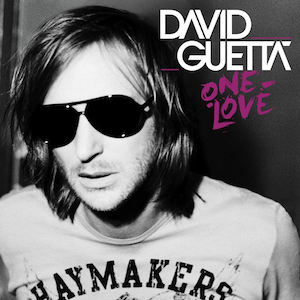
The typography of his name it white and bold and his own logo which allows the audience to remember where they have seen that font and style before. It stands out against the grey/black background which makes it easy to read and to spot, the name of the album ‘One Love’ is below his name which is in a font that looks like it has been painted in a dark pink/purple colour. It looks quite childish but appealing at the same time because it is messy but still readable, it is in quite a small style but the colour of the text makes up for the size.

DavidGuetta

The actual CD is silver and has writing all over it in the same format as the ‘One Love’ font which looks like a child has painted over the CD. It is messy and has various random lines smeared across it, this matches the dance genre because the colours of the black and pink together almost make it look like a paint party or something where a night out might get messy. It looks appealing because I haven’t seen anything like this before which connotes children and childish behaviour but is visually pleasing to teenagers and young adults as well.They use the circle in the middle of the disk as the ‘O’ to the ‘One Love’ which is quite unique and something extra to add to the CD.

This writing could suggest that David Guetta is fairly laid back and wants to have fun with the album and his music. He wants to say that he can do whatever he wants with his album, if it’s his music he can be as creative and wacky with it as much as he wants. This is both similar and different to other dance genre artists, as some don’t want to give away the fact that they are dance music and others want to show that off. Such as Calvin Harris’ 18 months, doesn’t connote that his music is dance whereas someone like Sub Focus who has various different colours on the front of his album which suggests house/electronic dance music almost instantly.

download

On the CD there is also a paragraph that explains the copyright to David Guetta and his record label and that all of his music may not be copied or used without his or the record labels permission.

davidguettae28093onelovenewversion2010

On the back of the album it has a list of all of the tracks that are on the CD, the colour scheme sticks to black, purple/pink and white and continues the messy paint effect throughout the whole CD cover. The same typography of David Guetta’s signature name is on the back as well so that the audience are familiar with the font and style of his name so that they can recognise him more often. In the bottom corner there is tiny logos of all the record labels and companies that helped with his music, this is a vital part of an album when it comes to making a digipak because we’ll have to chose a record label that matches our genre.

david-guetta-one-love-back-cover-19147

Digipak Analysis – Album Calvin Harris 18 Months

Calvin Harris’ 18 Months Album that was released in 2012 was a very popular dance album. The main image is plain of a street with a brick wall and Calvin Harris sitting on the floor looking away from camera, as Harris is looking away it could show that he doesn’t care for his appearance he just wants the audience to listen to his album. His arms are in a gesture that is pointing towards the typography The shot is a long shot which is bright and sunny as it shows the shadow of Harris across the bottom of the picture. The white typography and bold letters goes across the centre of the picture which stands out and defines who’s album it is. Having his first name first and bigger than the rest shows that he wants everyone to know that the album is his and underneath is the actual title of the album ’18 Months’ which was called that because it was roughly 18 months when the first song on there that came out.

calvin_harris_b_18months_cdcov

The image doesn’t really identify that the music on the track will be dance/house music and that might be because there isn’t any ‘Dancing’ or ‘Clubbing’ on the picture to make people think that it will be dance music. Bright and neon colours may have influenced this idea as well but obviously Calvin Harris didn’t want to stereotype his album, he didn’t want to be predictive. Harris only being in the shot could show that he got through these 18 months successfully and the shadow could represent all of those people that helped him along the way and on the album including Ne-Yo, Florence Welsh, Rihanna and Dillon Francis, this is also a benefit for Harris because people who are fans of the people he has worked with will be more inclined to go and buy the album because they have featured on it. He wouldn’t have been able to produce this album if it wasn’t for all of them who wanted to collaborate and make good music with him. Having the shot so simple could contrast with how busy and chaotic his last 18 months have probably been, he wants it to look like the journey of making the album was a breeze and fun and everything he expected when really, it was manic but all worth it in the end.

220px-BounceThinking_About_You_(Calvin_Harris_song)

The front cover has been the same typography, font and colour throughout all his different singles, including ‘Bounce’ released in 2011 and ‘Thinking About You’ released in 2013. This allows the audience to be familiar with albums, eps and any singles he releases because of the distinct white font and bold letters to catch their eye and want to see what album it is.

The CD cover is plain black with the same typography and white writing used on the album cover and all of the single covers. It’s simple and plain but effective in the way that it’s visually pleasing, below his name and the name of the album is his record label and a piece of text that says about copy right.

calvin-harris-18-months-album-cover-i9

On the back it is an extreme long shot of the first image on the cover of the album, it shows Calvin Harris sitting just left of the centre and is now looking forward. Now we get to see more of the location that he is in which is still plain and simple but seems like a nice and peaceful place. The weather is good and there isn’t a cloud in the sky and is sunny which could connote that it’s best to listen to this sort of music when it’s hot and sunny and when you want to party. On the back is also a list of all the tracks on the album which are in white and are underlined which match with the same typography on the front and the CD.

In the corner are all the record labels that were associate with the album and helped along the way, below that again is a little paragraph saying that all rights go to Calvin Harris and the record labels and none of his work can be copied or used without their permission. There is also a barcode at the bottom which is vital when making our own digipaks because it is something that is easily forgotten but a main convention of an album.

71FYn9ioexL__SL1200_

Final Website

Final Website

Screen Shot 2014-12-18 at 12.45.19

This is the main home page on Fin Lee’s website, I changed the background from the palm trees from California to an image of Brighton because it relates to the ‘All I Think About’ Video and it also connects with his home town. In the right hand corner I have five different social media buttons that link to different pages, I chose these ones because they would be the ones a young, quirky and fun guy would have. We also created instagram and soundcloud profiles for him to make it seem more real.

We have the ‘All I Think About’ music video right in the middle which is embedded from YouTube, I chose to keep this in the same place because it’s good for promotion for whoever views the website because it’ll be the first thing they see. I have ‘Fin Lee’ in white typography that is bold and I took this from Sub Focus’ website because I thought it worked well and was good for catching peoples eyes.

On the side is a button directing you to iTunes and a caption that says ‘Buy All I Think About Now on iTunes’ which is also good for showing that if they liked the video and the track they can instantly buy it on iTunes. Below the video are three tabs which direct to different pages on the website About Fin Lee, Photographs and Live Photos. All have a picture or a piece of text to support the tab.

Then below that is a contact and subscribe bar for those who wish to get in contact with Fin Lee’s agent and allows you to sign up to his page to get updates and news sent to them when it happens. This allows the audience to get closer and feel closer with the artist and see what they are up to.

Screen Shot 2014-12-18 at 12.45.46

On the Photographs page this is what comes up, a load of pictures from the ‘All I Think About Video’ and other shots from behind the scenes that audience members haven’t seen before. This allows the audience to see the real Fin Lee and not the on screen Fin Lee which is a nice connection.

There are multiple photos and at the bottom there is a tab that says ‘Show More’ where I have preloaded other photos so it seems as if he has been really busy and there are a lot of pictures to look at. All range from the classroom to Brighton which is a nice contrast because they can see the action of the shoots.

Screen Shot 2014-12-18 at 13.07.26

This is the Live Dates page where I have carefully selected places and events that an artist like Fin Lee would perform at. These days there are a lot of concerts that involve a load of different artists and have about a half hour set each rather than touring or headlining their own like Culture Clash and Annie Mac and Andy C’s All Nighters. I chose 02 Academy around the country and small venues like Brighton Concorde and the Apollo so it seems more realistic than the London 02 or Wembley Arena.

I picked a load of places from around the UK so that it makes more sense that he is doing loads of different small concerts in different places rather than all being in just one town like London. I have put the dates clearly next to the name of the show and the place it is being held at, above that it either says Sold Out or Buy Tickets. I have connected the Buy Tickets tab to Ticket Masters Clubs and Dance page to make it seem more realistic. I have also spread them out so that they aren’t all happening at once and throughout 4 months.

At the end of each date I have placed a locator icon with Locate above it where I have linked them all to a google maps page of where each venue is incase people don’t know or want to know how far away it is from them.

First Draft of Website

Screen Shot 2014-12-11 at 12.02.09

This is my first draft of my website, I wanted to get a rough idea of what I wanted to do with it before I made it perfect for my artist and the target audience.

The background I picked I know doesn’t exactly go with Fin Lee’s music video and style as he is from England and you don’t get palm trees in England, but I wanted to have a background of a landscape or something natural for the mean time before I decide what I want.

I like that the name is bold and white and the typography is plain but catches your eye, I wanted it like this because I thought it looked quite cool in comparison to how ‘uncool’ Fin Lee is in his music video. I embedded the video of his music video just below his name so people are inclined to click on it and watch whilst looking at the rest of the homepage.

I made three sub pages at the bottom which includes photographs, about and live dates all with pictures or information. I will make these links to other pages when I continue making my site and keep it matching the theme with the same typography and colour scheme.

Our Final Music Video

Here is the link to our finalised music video – [x]

I am very pleased with how our music video turned out, I had had doubts since planning that it wouldn’t look the way we wanted it to but I am so pleased and has turned out better than expected.

I think that it tells the narrative well and allows the audience to let go and just watch and hopefully make them feel happy and have a good day. Everyone goes through that idea of just wanting to run away and do what they love instead of something they don’t like their job or school (in context). I think that we allowed the audience to connect to the character well because he is someone whom you can’t not love because he is fun and bubbly and only wants to have a good time.

From comments and feedback that we have been given I know that we can say that our music video is giving out the right message and just wants people to have fun. Everything that we originally planned for the video including messages, narrative and how the audience feel after consuming the video.